Kodeclik Blog
How to make a button in Javascript
In JavaScript, a button is an interactive element that can be created and manipulated to respond to user actions. You would have likely seen buttons on many web pages. For instance, an electronic commerce site like Amazon.com will have “Buy” buttons, Netflix will have “Subscribe” buttons, Kodeclik has “Register” buttons, and so on.:
How do you make a button in Javascript? Well first you need to design it so it displays on your webpage or website. Then you need to write the back-end code or functionality so it does what you want when somebody clicks on it.
The Simplest Javascript Button
The simplest button you can write is this:
<button id="myButton">Click me</button>But you need to embed this button in a larger HTML file so you can display it on your browser and visualize it. Here’s a basic button.html HTML file:
<!DOCTYPE html>
<html lang="en">
<head>
 <meta charset="UTF-8">
 <meta name="viewport" content="width=device-width, initial-scale=1.0">
 <title>JavaScript Button Example</title>
</head>
<body>
<button id="myButton">Click me</button>
</body>
</html>
It will display like so:

This is not looking so pretty, is it? So let us style it!
Designing a button
You can style buttons using CSS, either inline or in a separate stylesheet. We will do it inline.
Here is some updated code:
<!DOCTYPE html>
<html lang="en">
<head>
 <meta charset="UTF-8">
 <meta name="viewport" content="width=device-width, initial-scale=1.0">
 <style>
   /* Your CSS rules go here */
   button {
       background-color: #4CAF50;
       border: none;
       color: white;
       padding: 15px 32px;
       text-align: center;
       text-decoration: none;
       display: inline-block;
       font-size: 16px;
       margin: 4px 2px;
       cursor: pointer;
   }
 </style>
 <title>JavaScript Button Example</title>
</head>
<body>
<button id="myButton">Click me</button>
</body>
</html>
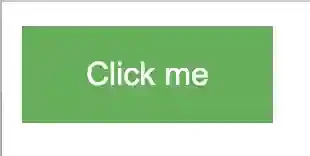
You can see that the code is pretty much the same except the button styling inside the “style” tags. These rules set the button's background color to a shade of green (#4CAF50), remove the border, set the text color to white, add padding, center the text, remove text decoration, display it as an inline-block element, set the font size to 16 pixels, add margin, and change the cursor to a pointer when hovering over the button.
The button will now look like:

Creating rounded corners for your button
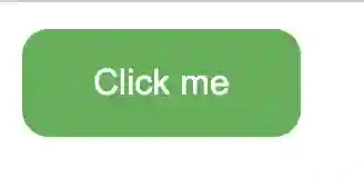
Let us add the below line to your styling:
border-radius: 12px;The button will now become:

Adding hover effects
Now let us add some hover effects so your button changes color when your mouse hovers over it. This is useful because it provides immediate feedback to the user that your website is listening to the user’s actions and movements.
Your updated code will look like:
<!DOCTYPE html>
<html lang="en">
<head>
 <meta charset="UTF-8">
 <meta name="viewport" content="width=device-width, initial-scale=1.0">
 <style>
   /* Your CSS rules go here */
   button {
       background-color: #4CAF50;
       border: none;
       color: white;
       padding: 15px 32px;
       text-align: center;
       text-decoration: none;
       display: inline-block;
       font-size: 16px;
       margin: 4px 2px;
       cursor: pointer;
       border-radius: 12px;

   }
   button:hover {
       background-color: #45a049;
   }
 </style>
 <title>JavaScript Button Example</title>
</head>
<body>
<button id="myButton">Click me</button>
</body>
</html>
Note that there are now two parts to the “style” portion of your document, one for the basic button styling and one for the styling when you hover over your button. The background color changes to a darker version of green.
Creating a grid of buttons
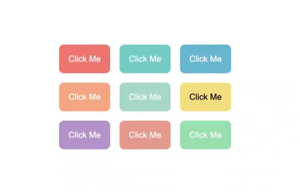
Let us make things more interesting and create a grid of buttons all screaming “Click Me” at us! Below is the code for that;
<!DOCTYPE html>
<html lang="en">
<head>
 <meta charset="UTF-8">
 <meta name="viewport" content="width=device-width, initial-scale=1.0">
 <title>Colorful Button Grid</title>
 <style>
   body {
     display: flex;
     justify-content: center;
     align-items: center;
     height: 100vh;
     margin: 0;
     font-family: Arial, sans-serif;
   }
   .grid-container {
     display: grid;
     grid-template-columns: repeat(3, 1fr);
     gap: 20px;
     max-width: 600px;
   }
   .grid-item {
     padding: 20px;
     font-size: 18px;
     text-align: center;
     border: none;
     border-radius: 10px;
     cursor: pointer;
     transition: transform 0.3s ease, box-shadow 0.3s ease;
   }
   .grid-item:hover {
     transform: translateY(-5px);
     box-shadow: 0 5px 15px rgba(0,0,0,0.3);
   }
   #btn1 { background-color: #FF6B6B; color: white; }
   #btn2 { background-color: #4ECDC4; color: white; }
   #btn3 { background-color: #45B7D1; color: white; }
   #btn4 { background-color: #FFA07A; color: white; }
   #btn5 { background-color: #98D8C8; color: white; }
   #btn6 { background-color: #F7DC6F; color: black; }
   #btn7 { background-color: #BB8FCE; color: white; }
   #btn8 { background-color: #F1948A; color: white; }
   #btn9 { background-color: #82E0AA; color: white; }
 </style>
</head>
<body>
 <div class="grid-container">
   <button id="btn1" class="grid-item">Click Me</button>
   <button id="btn2" class="grid-item">Click Me</button>
   <button id="btn3" class="grid-item">Click Me</button>
   <button id="btn4" class="grid-item">Click Me</button>
   <button id="btn5" class="grid-item">Click Me</button>
   <button id="btn6" class="grid-item">Click Me</button>
   <button id="btn7" class="grid-item">Click Me</button>
   <button id="btn8" class="grid-item">Click Me</button>
   <button id="btn9" class="grid-item">Click Me</button>
 </div>
</body>
</html>
The code above creates a 3x3 grid of buttons where each button has a unique background color.

The buttons are arranged in a responsive grid layout. All buttons have rounded corners (border-radius). Buttons have a hover effect that lifts them slightly and adds a shadow. The grid is centered on the page both vertically and horizontally. Finally, the font is set to Arial for better readability.
Note also that the buttons are styled individually using ID selectors (#btn1, #btn2, etc.) to give each a unique color. The hover effect is applied to all buttons using the .grid-item:hover selector.
This design creates a visually appealing and interactive grid of buttons without any backend functionality. You can easily modify the colors, sizes, or add more buttons by adjusting the CSS and HTML accordingly.
Now all this is fine and dandy but our buttons still don’t work! In other words, when you click on a button something is supposed to happen but nothing really happens. Lets do something about it!
In colloquial terms we say that we have completed the front-end for our project but not the back-end. We need to add the functionality explicitly in our code.
Adding event listeners to buttons
One common feature we will typically desire is that when the button is clicked we wish to navigate to a new page. Let us go back to our single button example and update the code so that when the button is clicked we move to the homepage of kodeclik.com.
The way we accomplish this feature is to add so-called “event listeners”. Event listeners are pieces of code that wait for specific events to happen (in our case the event is the act of somebody clicking on the button) and when those events happen to take some action.
Here is the updated code for that:
<!DOCTYPE html>
<html lang="en">
<head>
 <meta charset="UTF-8">
 <meta name="viewport" content="width=device-width, initial-scale=1.0">
 <style>
   /* Your CSS rules go here */
   button {
       background-color: #4CAF50;
       border: none;
       color: white;
       padding: 15px 32px;
       text-align: center;
       text-decoration: none;
       display: inline-block;
       font-size: 16px;
       margin: 4px 2px;
       cursor: pointer;
       border-radius: 12px;

   }
   button:hover {
       background-color: #45a049;
   }
 </style>
 <title>JavaScript Button Example</title>
</head>
<body>
<button id="myButton">Click me</button>
<script src="script.js"></script>
</body>
</html>
Note that we have added the below line:
<script src="script.js"></script>Now script.js is a Javascript file that will get invoked when this page is loaded into the browser. This file contains the below code:
const button = document.getElementById("myButton");
button.addEventListener("click", function() {
   window.location.href = "https://www.kodeclik.com";
});
Here is an explanation of what this code does. Even though it is small, it packs a punch in terms of its functionality. The first line selects the HTML element with the id "myButton" using document.getElementById() and assigns it to the variable button. This assumes there's a button element in the HTML with id="myButton" (which we know to be true since we designed that page). Then, an event listener is added to this button using addEventListener(). The listener waits for a "click" event. When the button is clicked, the anonymous function inside the event listener is executed. This function uses window.location.href to change the current page's URL to "https://www.kodeclik.com". As a result, when a user clicks the button, their browser will immediately navigate to the Kodeclik website1. This is a common technique used in web development to create navigation elements or to redirect users to specific pages based on their interactions. As a result of clicking we will get the Kodeclik page:

You can do more expressive things with buttons. For instance, you can make a button to create a “clicked game”. In other words, we keep a counter that is incremented every time the user clicks the button and that counter can be displayed dynamically to show the current value. Checkout our blogpost on how to build a simple clicker using Javascript.
Summary
In summary, buttons are interactive elements in web pages used for user actions. Examples include "Buy" buttons on e-commerce sites, "Subscribe" buttons on streaming services, and "Register" buttons on educational platforms. Buttons can be created in HTML and manipulated with JavaScript, or dynamically created using JavaScript. CSS can be used to style buttons, either inline, internal, or in an external stylesheet. Various styling options include changing colors, adding hover effects, rounded corners, gradients, shadows, and animations. Event listeners are used to add interactivity to buttons. Buttons can be used for navigation by changing the window.location.href property.