Kodeclik Blog
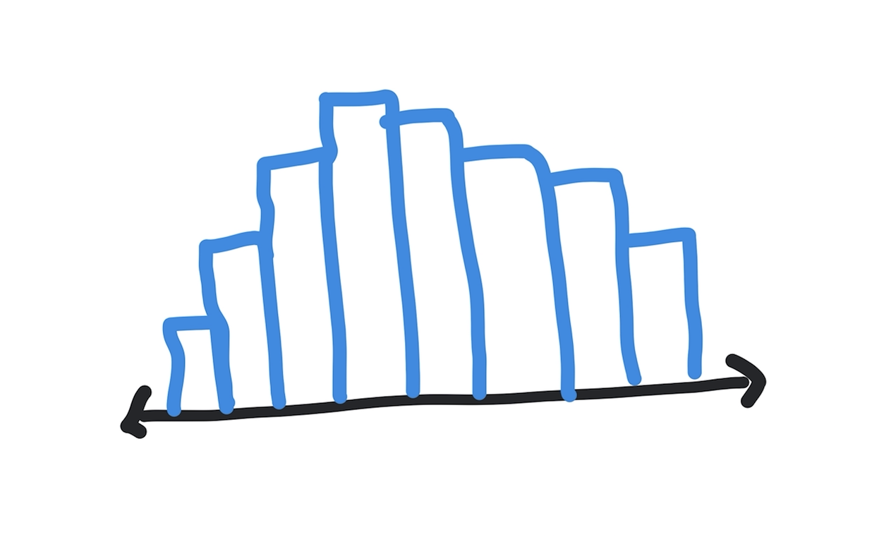
Histograms in Python
A histogram is a way to understand the distribution of data. Assume you have student scores in the form of a list like so:
scores = [80,80,77,85,67,82,98,95,93,77,77,
          82,82,91,91,82,89,100,55,100,76,77]
You can observe that the highest score is 100, the lowest score is 55 and there is a wide distribution of scores in between them. Some scores, like 80 and 91 appear twice, some scores like 77 appear four times, and so on. A histogram is a way to understand these patterns.
In this blogpost we will develop a way to compute and plot a histogram from this data.
The first step is to group data into intervals, buckets, or values. Here we will simply count the number of times each score appears.
Compute the histogram
Let us write a Python function count_occurrences() that takes a list such as above and outputs a dictionary where each key is a specific score and the value associated with that key is the number of times the given score appears.
Here is how such a function might work:
def count_occurrences(s):
  histogram = {}
  for i in s:
    if i in histogram.keys():
      histogram[i] = histogram[i] + 1
    else:
      histogram[i] = 1
  return histogram
Note that the input is the list (“s”) and the output is the histogram variable, which is a dictionary. We use a for loop to iterate through each element of the list. For each element we see if it already appears as a key in the dictionary. If it does we increment the count. If not we initialize the count to 1.
If we apply it on the above scores list like so:
scores = [80,80,77,85,67,82,98,95,93,77,77,
          82,82,91,91,82,89,100,55,100,76,77]
print(count_occurrences(scores))
we get:
{80: 2, 77: 4, 85: 1, 67: 1, 82: 4, 98: 1, 95: 1,
 93: 1, 91: 2, 89: 1, 100: 2, 55: 1, 76: 1}
Printing the histogram
We can now pretty print the dictionary like so (after sorting on the keys):
for a,b in sorted(count_occurrences(scores).items()):
  print(a,b)
The output is:
55 1
67 1
76 1
77 4
80 2
82 4
85 1
89 1
91 2
93 1
95 1
98 1
100 2
You can see clearly that the scores 77 and 82 appear the highest, namely 4 times each. You can see that the lowest score is 55, which appears once. The highest score is 100, which appears twice, and so on.
Plotting the histogram
Finally we can pretty print these values by using asterisks (stars, “*”) in place of the numbers so we can visually see the bins that are bigger and those that are smaller.
for a,b in sorted(count_occurrences(scores).items()):
  print(a,' ',end='')
  for i in range(0,b):
    print("*",end='')
  print()
In the above code, we first print the bin value and then print a series of asterisks proportional to the count for that bin. We use “end=’’” to stay on the same line.
The output is:
55  *
67  *
76  *
77  ****
80  **
82  ****
85  *
89  *
91  **
93  *
95  *
98  *
100  **
You will notice that the last key, which is 100 (and has three digits), appears a little offset. To fix this problem we can use a formatted print statement when printing the bin value:
for a,b in sorted(count_occurrences(scores).items()):
  print("%3d " %a,end='')
  for i in range(0,b):
    print("*",end='')
  print()
In the above code we use three characters to print the key and thus the keys are all right aligned. This leads to a more elegant output:
55 *
  67 *
  76 *
  77 ****
  80 **
  82 ****
  85 *
  89 *
  91 **
  93 *
  95 *
  98 *
 100 **
As you can see this is a much prettier plot.
Here is the full program we have built so far:
def count_occurrences(s):
  histogram = {}
  for i in s:
    if i in histogram.keys():
      histogram[i] = histogram[i] + 1
    else:
      histogram[i] = 1
  return histogram

scores = [80,80,77,85,67,82,98,95,93,77,77,
          82,82,91,91,82,89,100,55,100,76,77]

for a,b in sorted(count_occurrences(scores).items()):
  print("%3d " %a,end='')
  for i in range(0,b):
    print("*",end='')
  print()
If you liked learning about histograms, checkout our blogpost on iterating through a Python dictionary.
Interested in more things Python? Checkout our post on Python queues. Also see our blogpost on Python's enumerate() capability. Also if you like Python+math content, see our blogpost on Magic Squares. Finally, master the Python print function!
Want to learn Python with us? Sign up for 1:1 or small group classes.
